6/28/12

Paper Mache Eye - Take 2

Well, where I left of last time, I had plans for a new eye.  And, not so surprisingly, I've been working on it.  I had a new set of interesting issues that popped up with the new design.  But it's been fun and ... slightly messy.  Paper mache is not a very forgiving medium, or so I've discovered.


Well, to refresh, I did a series of quick sketches to get a better idea behind how I want to structure this new eye. Retina, non-visual retina, iris, sclera, etc.  Possible cornea.


And here, I've used my layout ideas and sketched it out on the tape over my balloon armature.  Just to get that first paper mache layer in a better position.


Alright, I've put on the first layer for all of the anatomical details.  I'm not sure how the layering will work, but I'm game.  I have a yellow base for the retina, a red one for the non-visual retina, and a green for the iris base.  I do want a blue eye eventually. 


I've put a second yellow layer, moving up the side of the non-visual layer. Also, I've put the blue tissue paper on the iris, also moving the iris down the non-visual part of the retina.  I'm hoping to blend everything together using just tissue paper, but it's not looking so good.


Well, I may have forgotten to take a few pictures, but this is the result of a few steps.  I was not liking how the iris was looking at all.  Nothing like an actual iris. So, I scrunched up blue tissue paper into small, semi-trianglular pieces to put radiating out from the pupil.  I also added a few green, and even a yellow one here and there.  It was a mess.  A Mess.  I then added red back over the non-visual retina part. But... I'm still not particularly happy about any of it.  Hmm...


So I tried to put a blue layer of tissue over the iris... but it really wasn't transparent enough.  You will see in the sclera that the white becomes super translucent once dry, but the colors don't have the same reaction.  I think it's because the actual construction of the tissue paper is different.  The white tissue paper falls apart much, much easier.


I have added the vessels before I put the orange layer on.  I brought the orange up over the non-visual part of the retina to try and bring two layers together.


I'm liking the way the vessels look, but not the transition between the retina and the non-visual retina.  Or the iris.  Time to break out something I haven't done in 5 or more years.


Actual painting.  I'm super stoked.  And my little tiny craft table is getting slightly overwhelmed at this point.


Using a light, transparent layer of acrylic paint, I added a reddish blend between retina layers.  And a blue/green iris.  The iris will need another layer of paint, but it's looking good for now.  I'll wait until the eye is closer to finish to put the final touches on the eye.  I didn't want to use paint, I really wanted this to be completely tissue paper, but I'm glad I changed my mind.  The retina, at least, looks a million times better.


I've started to add the sclera onto the eye now.  As you can see, even with two layers of white tissue paper, it's extremely transparent.


I'm using a folded edge to get a better line along the edge, and along the iris edge.


As you can see here, the wet layer looks really, really thick.  It can be difficult to judge where I need more paper while the paper is wet.  I do believe that this is 8th layer?  I'm also trying to add at least two layers of tissue at a time, not just one.


This is that previous layer, mostly dry.  There will be a little more translucency gained as it dries overnight.  But, I'm going to add one more layer on tonight, and then let it dry.  I'm also going to add one more layer of vessels, since the white has finally started to cover the original ones. 


I'm getting closer to the finish of this incarnation of my eye.  I may do one more after this one, if it doesn't turn out the way I want, but I'm pretty close.  I have one more eye tile to do, and I came up with a great idea today.  But we do have a little more to cover as far as the eye goes.  The tissue paper is surprisingly strong when it is dry too.  Signing off!


6/26/12

Paper Mache Eye

I'm taking anatomy a little more sculptural in the this (and at least one follow-up) post.  I want to make a paper mache eye.  And not just any type of eye.  I have a few restrictions - the eye has to be on a 4" x 4" board.  I want to include a light at the back.  I want the retina to be translucent but the sclera to be mostly opaque.  I'm including thread as vessels in the eye.  I'm working out how to make the cornea too...


So, I've tried one eye and it worked out... okay.  Not fantastic, but a good first concept.  I also learned that paper maché takes forever.

Much of what I've been trying has been inspired by The Ultimate Paper Mache blog and her book, Make Animal Sculptures with Paper Mache Clay.  I haven't actually used the clay yet, although it looks super cool.  But I've found some great information about different types of paper mache binders and papers to use.  Now, here's the different things I've tried out on my first couple of rejected eyes.


first try
This first attempt was pure glue directly on the balloon.  It didn't work.  At all.  But, it was a good experience.  I did some more reading and found about things like shells and masking tape and mixtures and such.


new layout with different materials
So, I scrapped the first balloon and moved on to a second attempt.  This one I actually taped down to a 4" x 4" piece of cardboard.  And I then used lotion to cover the tape.  This will (theoretically) make the eye structure separate from the mold much easier in the future.

I also switched to a glue/water mixture - roughly 1 part water for 4 parts glue.  Very roughly.


the first layers take the longest to dry...
So, I've covered my taped and lotioned up balloon with yellow tissue paper and the paper maché glue mixture.  At this point, I'm not really planning on the actual eye.  I'm mostly testing things out  I don't even know if tissue paper will make the type of translucent retina that I am going for.


I do know that I want to use a mixture of yellow and orange tissue paper combined with red thread to make the retina.  Probably.


thread vessels could be threadier
Right now I have this slightly strange expectation that the back of the eye will be along one side of this rounded square.  I'm not sure what I was thinking, but that was what I had fixated in my mind at the time.  So, I started to grow my vessels from that area, as they would have been carried through the optic channel.  That's what I get for poor planning...

I am laying the thread on and covering it with orange paper.  I already have around 3 layers of yellow paper on. The construct is kinda stiff, but still bendable.  I am using a space heater to dry the layers faster at some points.


patience is a virtue
I've started to try and add a sclera on half the eye.  I added more vessels under the white... as is apparent.  However, even with three layers of white, I'm not seeing much of any white.  It did give me a great idea for the cornea though.


a strange, creamy looking mixture with the wrong paper
And then I got a little... too enthusiastic to get that white look.  I think for the future, I need to be very, very patient and build up the thin layers of paper.  This just doesn't look right, and you can barely see any vessels underneath.


better, but not awesome
I put another layer of vessels on and a different type of white paper over it.  It's still not thin enough, but it was better.  After thinking about it, I'm not too upset about needing 15 million layers of white tissue paper- actual sclera is pretty thick compared to the retina.


don't use the ovenAnd another lesson in patience.  Instead of relying upon the space heater for drying purposes, I tried to put the mostly dry eye into the oven.  It didn't work.  My understructure completely collapsed.


again, patience wins
Neat balloon and tape texture from the broken understructure.


the inside looks very nice
I cut the eye from the base.  This is a view of the inside, no pupil.


linseed oil is neat
You can see some of the vessels better once that paper was dry.  I added in some linseed oil to the paper maché paste in these last few layers.  It gave it a great sheen and a bit more transparency.


I love the idea of the light in the sculpture
Let there be light!  My little drawer light looks pretty cool in there.  I have some ideas on how to be able to turn a battery powered light on and off from outside the eye, but I'll go into more detail on those when I actually start to implement them.


lovely light
And a view with the overhead light off.  Even the sclera has just a bit of bleed through.  As such, it may need a solid red layer underneath it to give a better color under the white.


Well, that first eye was a lot of fun.  And it taught me a great deal about paper maché and binding mixtures, etc.  My hands also smell like a strange combination of linseed oil, soap, glue, and coco butter lotion...

However, one thing I definitely noticed right off was that I didn't have a great plan on that first eye.  I didn't lay the tape out well, so the wrinkles formed from the tape carried through the tissue paper layers.  I was lazy and used large strips of paper.  These wrinkled quite a bit, going over the curves of the balloon.  So, smaller bits it is.  And I need to figure out what I want to do with the iris before I actually start the build.
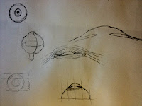


simple eye sketchesI did some very, very simple sketches of an eye to better understand the underlying anatomy. 


There is the pupil area, which is just a hole.  And it will be a hole in this build as well.  It will let the light through and it will allow people to see the painted back surface after the eye is done.  (Because the paper maché is just half of an eye, the back half will be painted onto the flat piece of board the eye is going to be mounted on.)

Then we have the iris itself.  I think I want this eye to be blue, as that will contrast with the orange retina the best.  However, I want some color variation, not just plain blue tissue paper, so I hope that turns out okay.  We'll see, as I start to build up the color.  I'm not expecting the iris to be transparent at all.

I'm not going to be simulating the cilliary body or the lens.  At least, I'm not planning to at this point.  It would be very tough.  I would have to find some sort of clear oval object to hang, or sew, directly behind the pupil.  And I don't really want to obscure the view of the back of retina.  Hmm...  Nope, not planning on including it right now.

The retina actually has an area that is 'nonvisual' and I think I'm going to try to use color to differentiate it.  It's directly ancillary to the iris, which makes perfect sense if you think about it.  It's not depicted well in many images, but I'm going to try to make it a reddish blueish orangish color.  We'll see.  I want it to blend well with the rest of the retina while still being distinct. I'm thinking that it would be pretty awesome to blend the transparency as well, but I'm not going to hold my breath on that part.

And finally we have the retina and sclera layers.  The retina I will be adding to the entire eye.  That way the inside of the eye will be completely contiguous with the drawing on the back of the illustration board.  The sclera will only cover half of the eye, as it did in the original concept.

I've started working on a third balloon, and I'll expound upon that as I work more on it.  


6/23/12

Dog Anatomy 2

So, I'm back again with some more canine anatomy studies.  Today was also a study in the adage 'save often' - Photoshop crashed and took my entire skeleton and muscle system with it.  Go figure.  But, I recreated it in a much rougher form and I'm still going to share it.  These studies will eventually be turned into an actual dog.  I'm torn between an action pose and the sleeping pose for the final piece.

Sketching from a photo of Oshie.  Rough sketch.

Refined the rough sketch just a bit.

Grabbed some more skull references in addition to Ellengerger's Animal Anatomy book and drew in the skull.  Nothing was in the exact right pose, but I'm feeling a little better about canine skulls in general now.

I started to rough in the rest of the skeleton.  This is the last stage I had saved before the crash.  I ended losing all of the finished skeleton and most of the muscles.

 A much rougher overall skeleton to replace what I had lost.

A 15 minute color study of the skull.

A very fast muscle study again.

I'm just about ready to move on to a final pose.

Breakdown of 'Connection'

So, I recently participated in a challenge called "Manga Mania." I decided to rework an old dryad/forest spirit idea I had sketched out over 10 years ago.  I wanted to work in a background and flesh out the 'connected to nature' angle I hadn't captured before.

I had a great time with this contest - I haven't drawn "anime/manga" in a lion's age.  So, I have a few stages actually saved out, and you get to see the evolution of the image.  Enjoy!


The original concept - from the year 2000
(boots? Why did I draw her with boots?)

Initial sketch based upon the original concept and some other references. I wanted to stay true to the original idea for the most part.
(sketches from other poses snuck in here and there)

Some basic color blocked in, and the form more finalized
(I decided the vines should be living... and I reaaaaly didn't want to bring them all the way down the leg so... vine shorts)

Colors more defined and some initial shading happening 
(She's growing from the forest floor.  Not just because feet are dumb.)

A background worked out and a few extras starting to appear 
(my recent trip to a very foggy forest inspired my background)

 Starting to tie the composition together
(light rays are always good)

 Working with shadows and highlights
(trying to bring the colors into harmony- right now she's very green and the background is very teal)

 Trying out a different look - no outlines
(not working)

 Brought the outlines back, but refined for a better "manga" look
(also working with the colors and hating on the face)

Trying out a different idea for the arms 
(swoopy arm vines?)

 Ditched the conceptual lines, but I liked the idea.... so, they are making appearances elsewhere. Also trying to refine the face, especially the eyes.
(the swoopy arm vines didn't work for me - but the glowy blue cracks I like)

 Working on the entire composition, trying to tie it together better by bringing the glowy bits into the background
(more cracks! I'm trying to bring interest to the foreground rock too, without it becoming overwhelming to the figure)

 Added some more 'glow' to the glowy bits and elsewhere
(trees need glowy line love too)

 Final tweaks to nose and other areas
(and the time limit for the contest is up)


I'm thinking that I might like to take this from a 'manga' look to a more realistic look.  I only did the manga for the contest, but I still like the overall concept.  So, there you go!  

6/22/12

Retopology Revisited

Well, it's been a while since I was last posting in this blog, and the landscape of 3D reoto'ing has changed a bit.  At least, the section that I use has changed.  I found a little program called 3D Coat, and I never looked back.


So I wanted to just mention some of the overarching things that I now do...  No details (yet).  I regularly use 3D Coat in my daily activities.  Truthfully, I prefer the tools within this program to be much more intuitive and easy to use compared to the other software that also does retopo'ing.  And I've done quite a bit of retopo'ing, let me tell you.  So far, I've looked at the bones of the arm, including the shoulder girdle, and every. single. muscle.  Seriously.


The muscles were segmented from grind data from a cadaver, edited in Maya to ensure accuracy, exported into 3D Coat, given a new topology, initially painted also in 3D Coat, refined in Photoshop, assembled in Maya, and then brought into Unity 3D for the (eventual) final app delivery.  

Both normal maps and the initial diffuse maps were created in 3D Coat.  The diffuse maps were modified in Photoshop for a better blend of tendon and muscle belly, but the placement of those elements was first conceived in 3D Coat.  Every model is definitely under 10,000 polys, and most are under 5,000 polys.  So, normal maps were essential in getting the look and feel that we wanted for each muscle and its fibers.

The same process can be used (and will be used) for the rest of the body.

Dog anatomy

I'm doing a series of images right now with canine anatomy.  Here are some of the sketches I've done today.  The first two are done by observing An Atlas of Animal Anatomy for Artists - a book that I haven't done enough studies out of yet.  Then, I started to sketch my dog, Oshie.  I topped it off with different rapid positions of her both in repose and in action.  Finally, I tried to lay in the proper skeleton in one of her action poses.  The angle was a little strange, so I may need to revist that one as I continue.


Ellenberger pose study - bones


Ellenberger pose study - muscles

Oshie face head on

Oshie face - looking up

Oshie studies - laying down

Oshie studies - action

Action pose - bone placement
  

Action pose - bone with color

Action pose - muscles 


(EDIT - I forgot to add the skeleton and muscles sketches to Oshie's 'action' pose)


11/1/09

Unity 2.6 Free to a Good Home


Well if you were ever on the fence about buying Unity3D... you no longer have to be! Happily announced at the UNITE09 conference this past week, the version formerly known as UnityIndie... is now FREE! Yes, that's right, free. Now known just as Unity, (the "indie") was dropped, it has all the features that UnityIndie had. For no money. The game engine that has "made people millionaires" is opening its doors to the students, hobbiests, and other less fortunate folk who couldn't afford this awesome program before.

Used by EA to develop their new Tiger Woods online golfing game, now able to build to the Wii system, and one of the most popular iPhone development kits... Unity is just a whole barrel-full of awesome. Check it out.


And while we are all very excited about the "freeness" of Unity, don't discount UnityPro either. This newest release, Unity 2.6, has some fantastic upgrades. Including a new Profiler to see exactly where your bottlenecks are, and an Animation editor that lets you graphically see and edit your characters. Or anything you feel like animating, really. But don't take my word for it. They have all of their new features laid out on their website, of course. But really, have I mentioned Free yet?